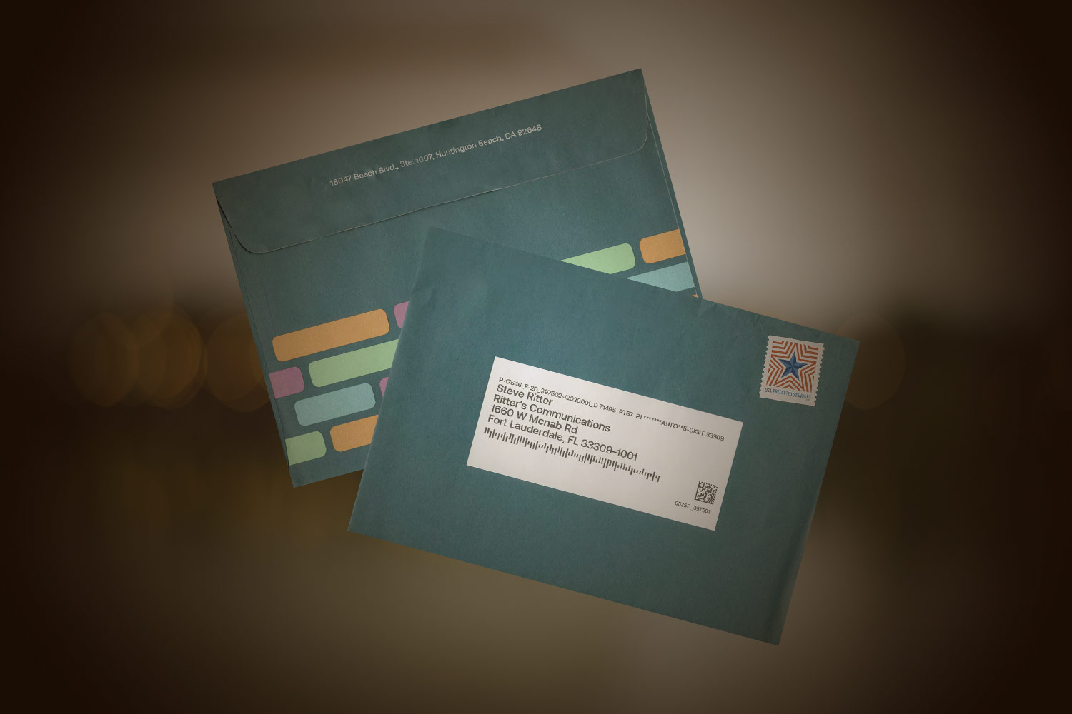
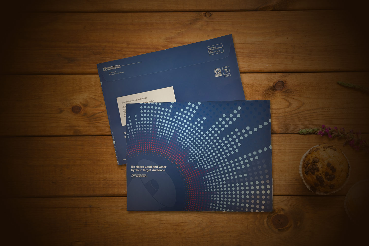
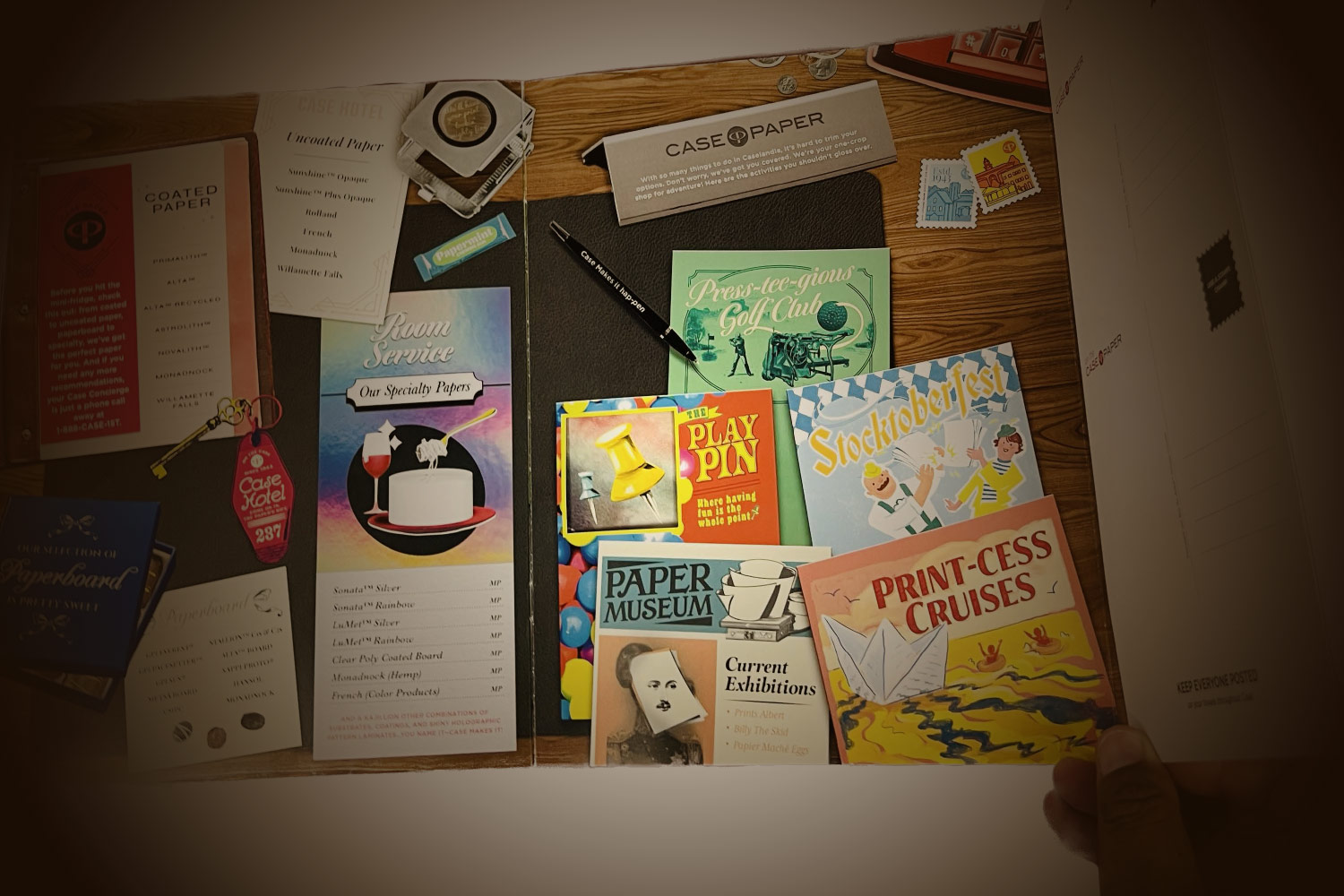
Why do companies send out direct mail? It could be to generate sales, announce a grand opening, drive traffic to their website, or even wish their clients a happy birthday. No matter the reason, the whole idea of sending a piece of mail is to be read by the end user and then prompt them to take some action (respond to an offer, place an online order or visit a retail store). Besides having a targeted list, compelling offer or copy and creative artwork, how about considering the materials along with specialty finishes and embellishments? Let’s take a closer look at some recent direct mail pieces that checked off some of these boxes.
Examples of direct mail pieces
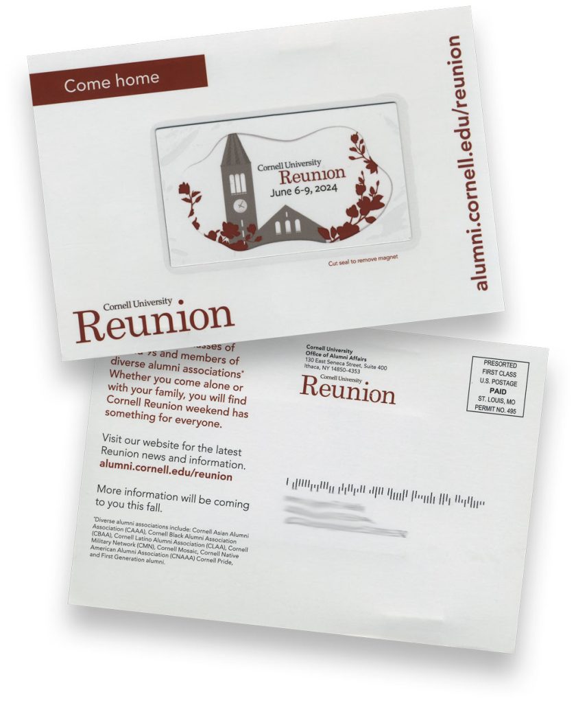
Cornell University sent a 4.5” x 6.5” postcard printed in red ink (after all, they are the Cornell Big Red) to select alumni as a save the date for reunion. The creative best practice they used was to attach a magnet to the postcard. Theoretically the alum would save the magnet and be reminded of the reunion dates. Because this was a postcard, the magnet was clearly visible to the recipient and the clear film covering and added thickness and weight of the piece also made it stand out. The magnet was printed with an image of an iconic place on campus as well as the reunion dates.

The CompuLab did multiple things right with their lead-generating direct mail. The piece consisted of a 6” x 9” outer envelope which checked all the boxes. It was oversized, it was an unusual color (bright green), they used a font that was not “businessey” and the return address was a person’s name (the owner of The CompuLab). The four inside sheets were filled with questions for the end user about their computer service as well as a quiz to see how their current vendor stacks up. The envelope was unique enough to make me open, especially because it was a little lumpy…what could it be? Turns out the lump was a pack of pain relief pills stapled to the inside sheets – if my head hurts from “dealing with the computer” hassles, well, here’s some pain reliever. Quite humorous and who doesn’t like a good laugh that leaves a lasting impression. The CompuLab also used a full-rate stamp which was a nice touch. Seeing an actual stamp might also get someone to open the mail piece as they figure it is not “junk’ mail.
A local realtor knows that personalizing her direct mail pieces will gain the trust of local residents. The postcard was 5.5” x 8.5”. She listed the usual listings nearby that she had sold as well as highlighting a current listing along with a large photo of the area. The “cool” factor was a doormat with the postcard recipient’s last name on it. Nice personalization and use of variable data to draw more attention to the mailer.

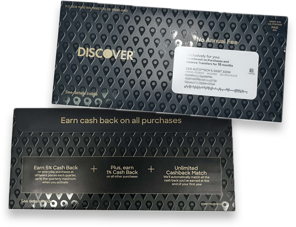
Discover Card sent a mailing with a superstar envelope. The envelope was 5” x 10 7/8” so quite a good size to stand out in the mailbox. What made it visually appealing was the use of the color and coatings. The envelope was printed with a black background with dull coating over the plain black and gloss coating over the pin icons that really showed contrast. They also used a small amount of gold ink for the company name and select text to make it stand out.
Best Friends does an amazing job of tugging at people’s heartstrings to help animals. How do they do it? Photography – they use high-quality photos that really capture the pet’s personality. This 6” x 10.5” self-mailer was tabbed shut and inside it held an 8.5” x 17” appeal letter and a return envelope. The topic of the mailer was big dogs and 10 things they adore about big dogs, complete with photos accompanying each item. The letter was used to make an emotional appeal about the fate of big dogs in shelters and how a gift could help advocate for the dogs. Loved the large size of the mailer and the way Best Friends drew me in with the dog’s facial expressions on both sides of the mailer. The front side also introduced the dog named Hulk and the letter told Hulk’s story. The back side of the mailer told of Best Friend’s mission to bring the entire U.S. to no-kill by 2025.

Direct Mail Campaigns
There are many ways to send direct mail – maybe next time you plan a campaign, you’ll think about the papers and special finishes to enhance your mailer. Additional ideas include adding a scent, metallic foiling and embossed textures and die cut shapes. The old saying goes “you get what you pay for” and direct mail is no different. Test, measure, adjust, and repeat to see what works best for your next campaign. No matter your medium or embellishment, your goal is to maximize your open rate. Good luck!
