With COVID-19 taking a toll on businesses across the globe, retailers are getting more creative with their marketing campaigns. Costco is just one of the many companies taking advantage of direct mail. In this direct mailer example, Ritter’s Printing & Packaging reviews how they did it.
A DIRECT MAILER EXAMPLE OF HOW TO CONNECT WITH POTENTIAL CUSTOMERS DURING A PANDEMIC
Connection is everything. Our connections with people, places, and things determine our engagements every day. In many ways, the pandemic has left people feeling less connected than ever before, with many of us working from home, canceling plans, and limiting our interactions with people outside of our immediate circles. For businesses, this has been especially challenging as less consumers are walking through the doors. A recent mailer from Costco illustrates just how one company managed to create a connection with customers despite the coronavirus crisis.
Let’s take a closer look in this direct mailer example that doubles as a greeting card.
Direct Mail Greeting Card Format
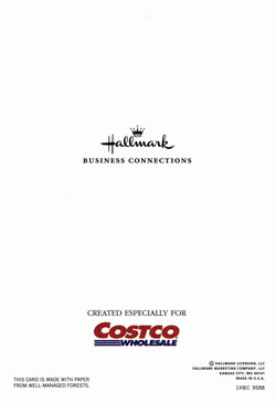
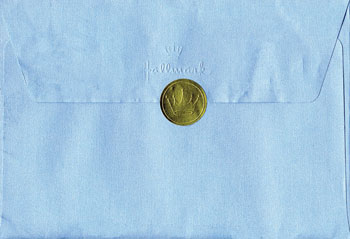
Format: Greeting card size. The blue envelope was 5 1/8” 7 ½”. The enclosed greeting card was 7” x 9.5” folding in half to 4.75” x 7”. There was a 4.5” x 6.5/8” card tucked into the greeting card.


Greeting Card Design
Design: Costco used a blue envelope with blue ink which invokes the look of a greeting card, not a piece of solicitation mail. They used a precancelled stamp, a “handwriting” font and even used a Hallmark round gold seal on the back flap. Hallmark cards are known for the gold crown in the seal so people would feel comfortable opening the card.
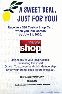
Costco also used a “mailers postmark” to imitate letter mail. The card and insert looked just like a greeting card – the front of the card said, “Summer is for Celebrating,” and the insert has the same image of a lemon and background pattern as the card.
The font on the card and insert was more informal, just like you would expect from a card from a friend.


Printing & Paper
There weren’t any special printing techniques used, the stock was heavy enough and it arrived in good condition.
Presentation
Appearance is everything! Costco deliberately designed this piece to look like it was coming from a friend or relative. The attributes of this mailing lend itself to a higher open rate. The card itself was actually a specially designed and printed card by Hallmark.
Purpose
Costco is using this piece to increase membership. They are pushing people to either visit their local store or visit the Costco website.
Offer & Call-To-Action
The offer was well presented, relevant and valuable. If any of those three key best practices was missed, the mailer would not be as effective. The offer was a $30 Costco card. The call to action was to sign up for auto renew by July 31, 2020. The expiration date was clearly stated, making the call to action a little timelier by adding a sense of urgency to the promotion.


Digital Technology Integration
None. One suggestion would have been including a QR code that takes the end user to the membership form.
Personalization
The card was personalized to the recipient which makes Costco connect more with the consumer
Ritter’s Conclusion
Overall, a solid direct mail campaign. Costco designed the piece to maximize open rate. People are often overwhelmed with advertising mail so anything you can do to make your mail piece stand out will help to increase your return on investment. A little added cost in production can boost the bottom line.
CONNECT WITH LOCAL DIRECT MAIL EXPERTS
If you’re looking for an effective marketing strategy, direct mail marketing is it. When it comes to response rates, direct mail engagements are 10% to 30% higher than its digital marketing counterpart. With a thoughtful direct mail campaign, you can reach your prospects with ease!
Ready to attract new customers? Contact Ritter’s Printing & Packaging today by calling 954-771-7204. We’re your powerhouse for direct mail marketing solutions.


