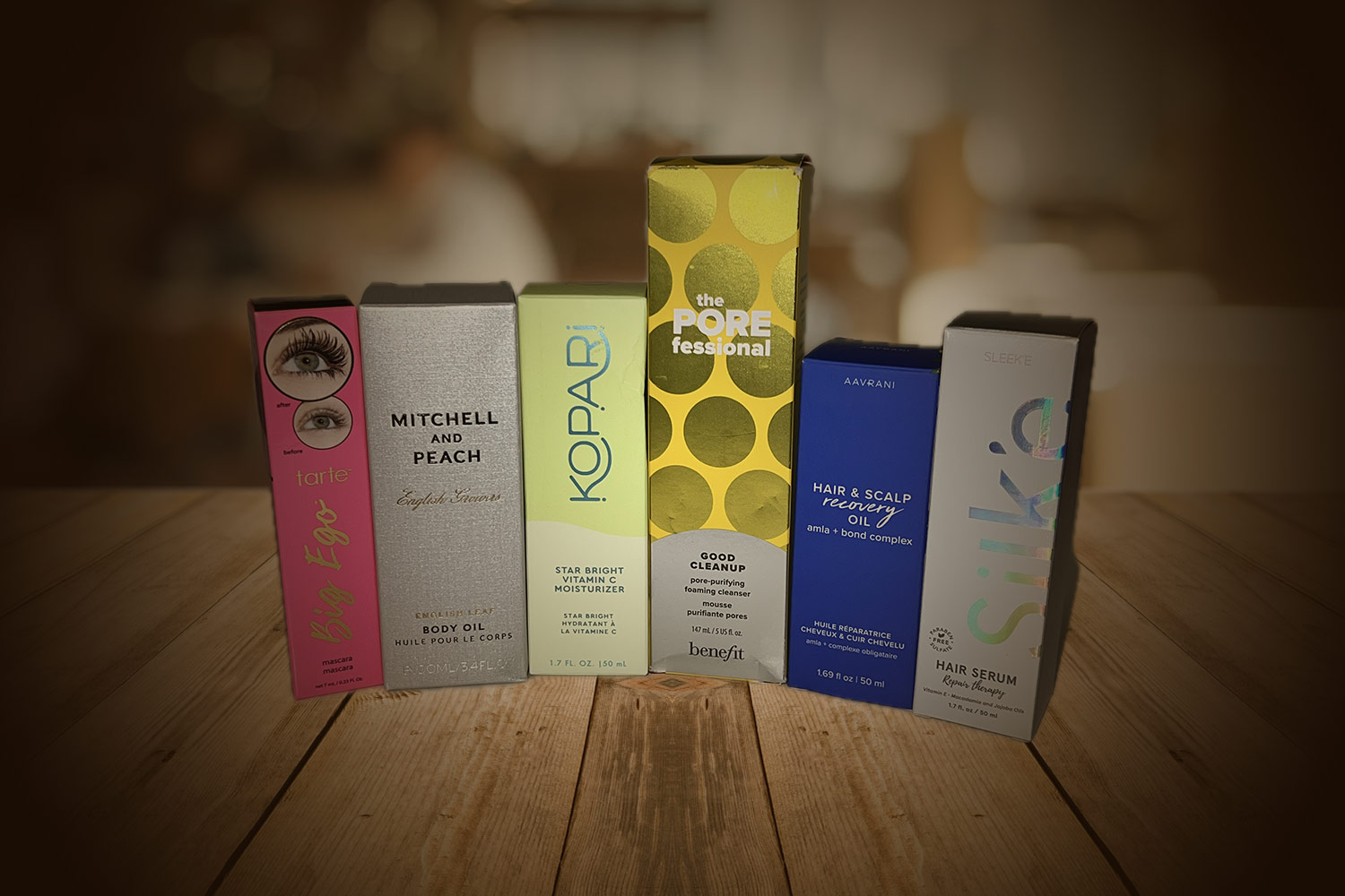
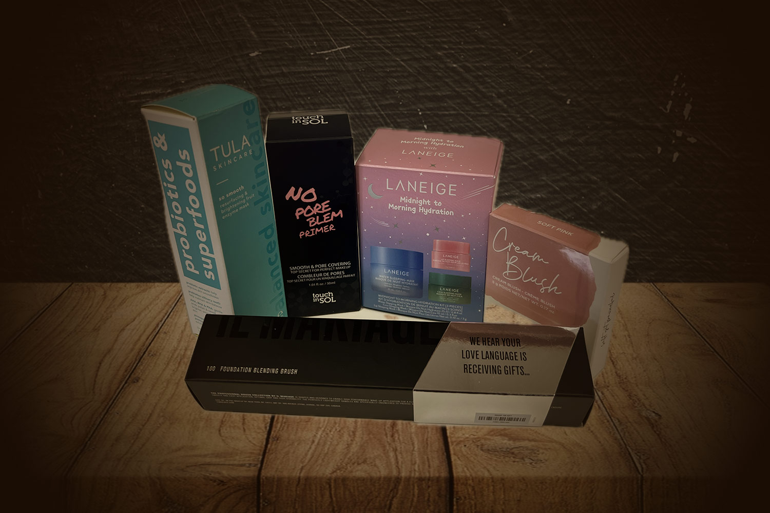
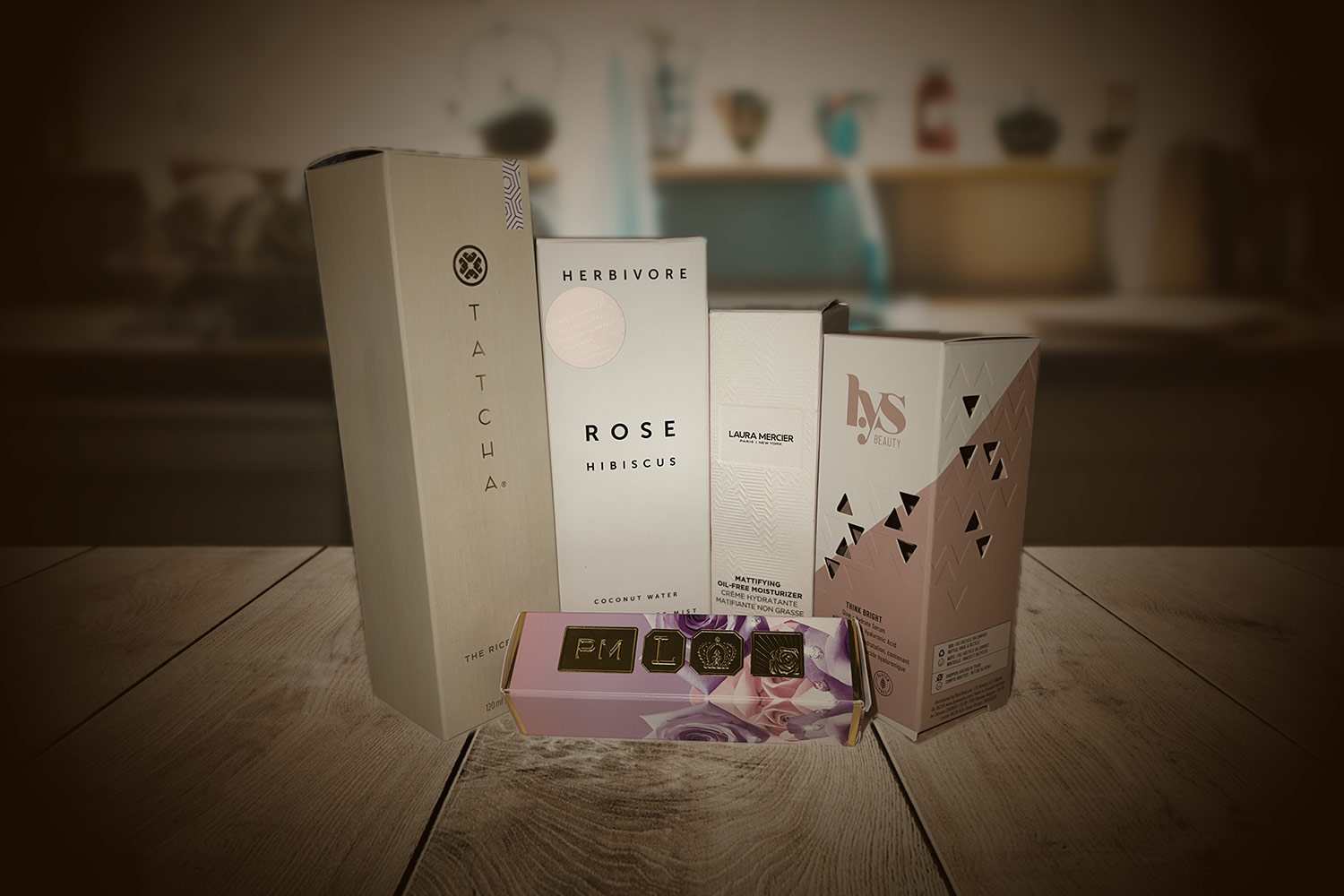
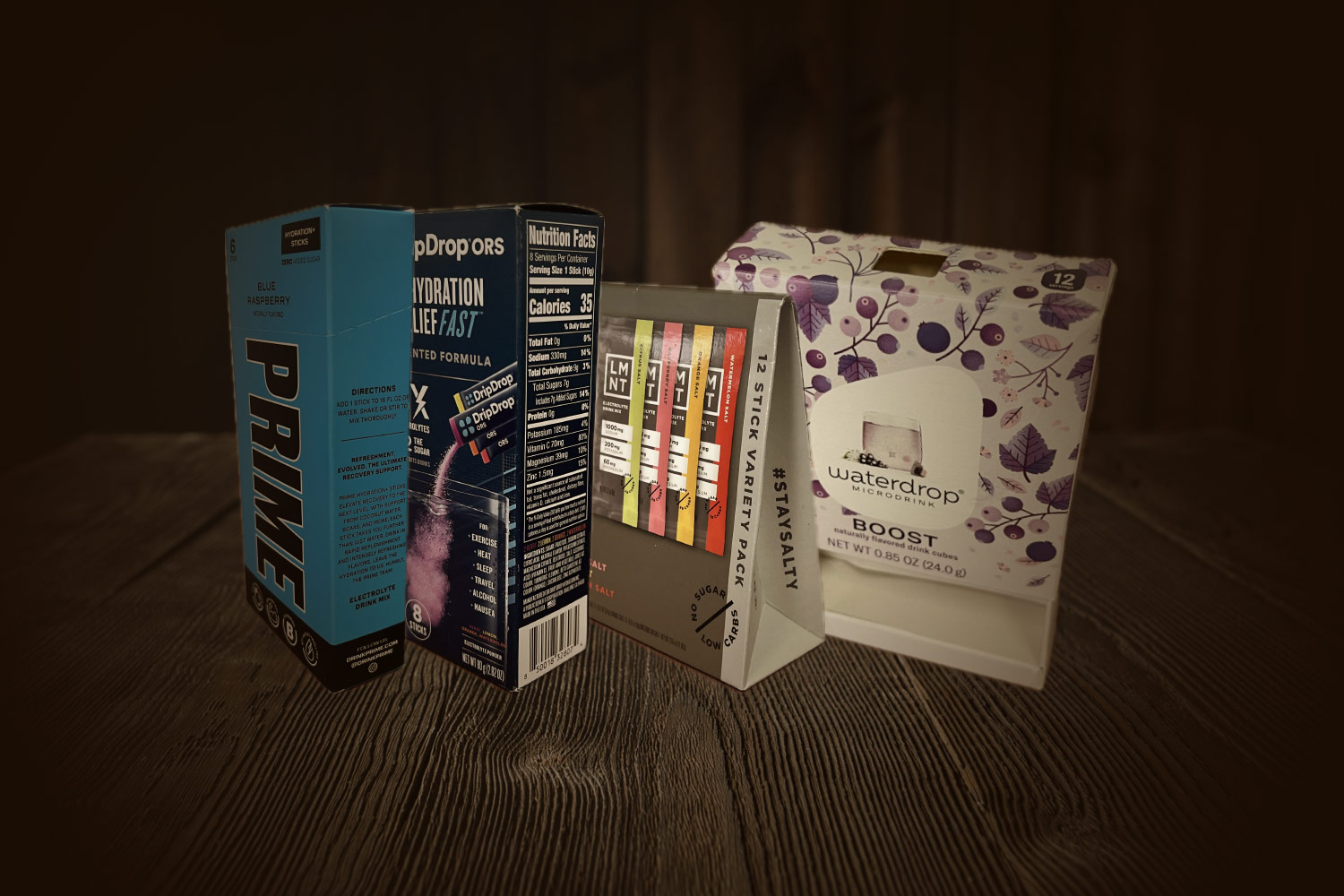
Getting your packaging to stand out from competing products is a balance between following the latest design trends and maintaining uniqueness. Knowing the latest cosmetic packaging design trends gives you the knowledge and tools to create packaging that resonates with today’s buyers while remaining true to your brand’s message.
In this article, we explore 6 cosmetic packaging trends that you can incorporate into your packaging designs to set your brand apart from the competition.
1. Minimalism design: reducing clutter for a streamlined look
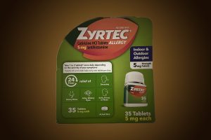
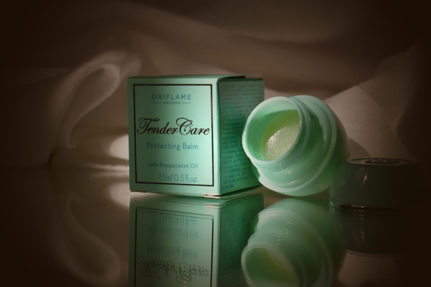
Minimalistic packaging design focuses on reducing visual clutter to create a streamlined, calming layout. These designs place less emphasis on graphics and images, focusing on colors and text to convey the brand’s message.
To create a minimalistic design, reduce your text to the essentials. Use clean lines, minimal shapes, and large washes of solid color.
Pros
- Easy to create a strong brand image
- Appears sophisticated and luxurious
- Text is clear and easy to read
Cons
- Style can limit creative options
- Risk of boring or unoriginal designs
2. Maximalism design: playing with excess for a fun and bold look
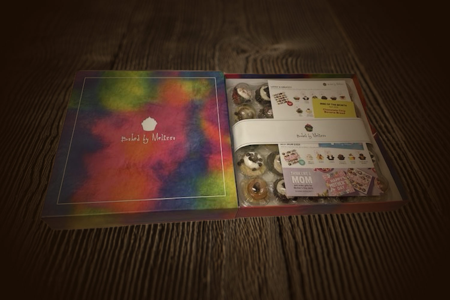
On the other end of the spectrum, there’s maximalist packaging design. This style uses bright colors and bold patterns, often using high levels of detail to add extra dimension and personality.
When using this type of packaging design for your product, it’s easy to convey your brand’s personality.
Pros
- Eye-catching, vibrant, and fun
- Easy to create a distinct brand style
- Can include a lot of information if needed
- Can incorporate many different colors without worrying about them clashing
Cons
- Quickly becomes visually cluttered
- Text can be difficult to read through patterns and colors
- Risk of feeling unsophisticated
3. Sustainable design: choosing eco-friendly options to help the planet
As more and more consumers push for brands to choose environmentally-friendly practices, sustainability has become more than a trend. If you want your brand to be competitive, it’s worth considering sustainable designs and eco-friendly packaging.
Sustainable options include using recycled paper and plastics, bio-degradable product stickers, refillable glass containers, and recyclable cardboard.
Pros
- Sustainability is a priority for an increasing number of consumers
- Good for the planet
Cons
- The initial transition to sustainable materials can be an investment
4. Unique typography: playing with fonts to convey your brand’s personality
Your copy (the text on your packaging) is a direct reflection of your brand’s voice. The font or typography you use reflects your tone and atmosphere.
Custom fonts also help differentiate your product from competitors, boosting product visibility. Increased visibility is one of the main benefits of custom packaging.
Custom fonts are a popular packaging design trend this year because of the way they immediately translate your brand’s personality to consumers.
Pros
- Completely customizable
- Conveys brand voice and tone
- Handwritten fonts look organic, young, and playful
- Script fonts can look elegant and upmarket
Cons
- Handwritten fonts can look messy and childish
- Custom script fonts may be difficult to read
5. Travel sizes: creating miniatures of your products for easy transportation
Travel-size products are smaller than regular products, and they allow for easy storage and transportation when customers are traveling. Travel-size products are also used as “on-the-go” products for everyday use, or as a way for customers to test out a product they’re unfamiliar with.
Many makeup and skincare companies offer travel-size products.
Pros
- Added functionality for customers
- Offers a budget-friendly tester to hesitant buyers
Cons
- Can’t include the same amount of information on the packaging due to the limited surface area
- It’s harder for smaller products to grab the attention of in-store shoppers
- Packaging costs are higher per unit of product for travel sizes
6. Wraparound designs: blending edges to create a seamless look
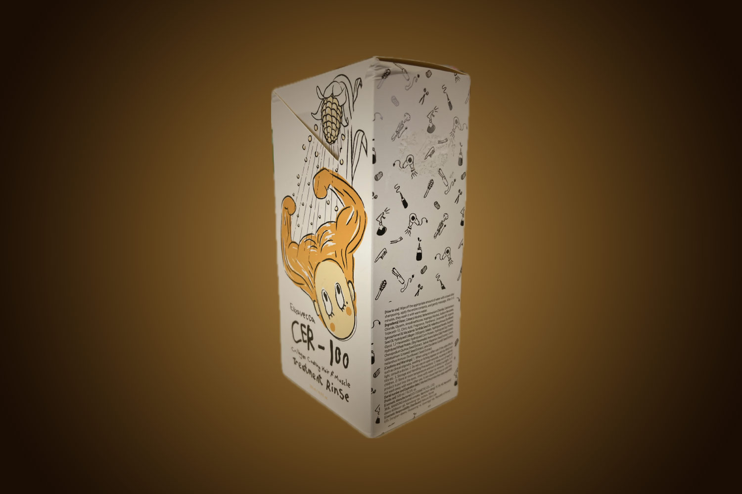
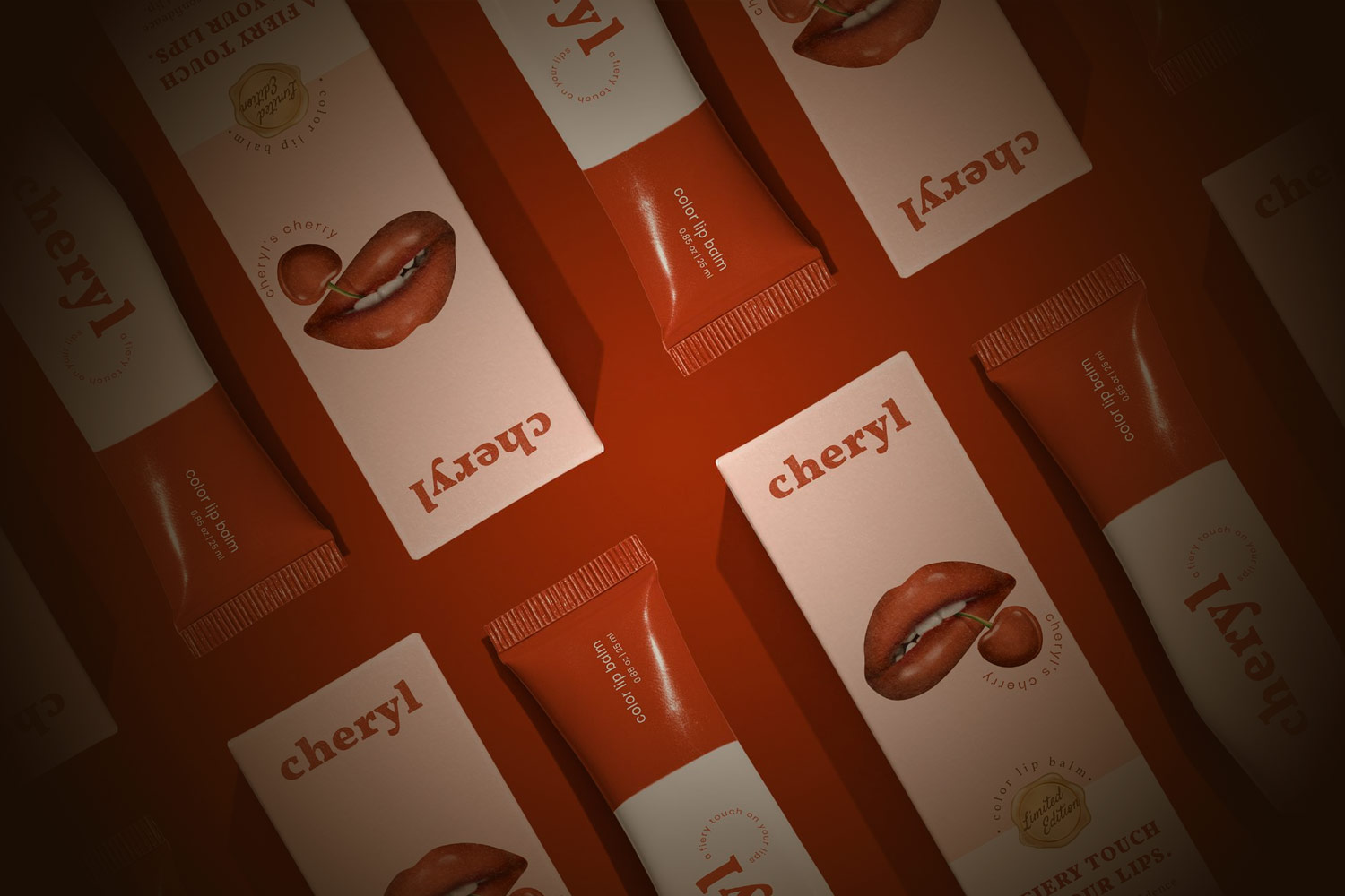
A “wraparound” packaging design refers to a pattern that covers the entire length of the packaging seamlessly. This creates a design that flows effortlessly over the edges and corners of the box.
Wraparound designs are most effective when your packaging uses a graphic, pattern, or print. With simple washes of a single color, the effect is less noticeable.
Pros
- Striking and satisfying appearance
- Creates a fluid and high-fashion style
Cons
- Can limit layout options
- Need to consider how the wraparound design looks when multiple products stand next to each other
Custom cosmetic packaging in South Florida
At Ritter’s Printing & Packaging we have years of experience perfecting various printing techniques and packaging strategies to help our clients’ products stand out. Let us create packaging solutions that accurately depict your brand and set you apart from the competition.
Family-owned, family-operated, and experienced with high-quality, sustainable printing techniques, Ritter’s Printing & Packaging is the company to trust with your packaging needs.
If you have any questions or would like to find out more about our production process, contact us at 954-771-7204 today.
