When you pry open your mailbox door, there’s always mail begging for attention. Some mail is really noticeable, while others just are not. We may not judge a book by its cover, but envelopes are a different story. Color, size, form and function all jockey to get you to open them first.
A BRILLIANT DIRECT MAILER EXAMPLE OF EYE-CATCHING ENVELOPES
It makes sense. If you send me something in a standard white paper envelope, I’m not typically bursting at the seams with excitement to open it—and I don’t think I’m alone on that. If your direct mailer envelope looks even remotely similar to another bill or credit card junk mail, you’ve lost potential customers at ‘hello’. Perhaps it’s time to try something different with your direct mail campaign. Cue eye–catching envelopes.
We have some recently delivered pieces and these envelopes really stood out. Let’s dig a little deeper into this direct mailer example with some rather conspicuous elements.
Envelope Formats
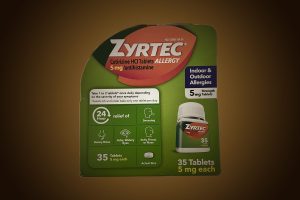
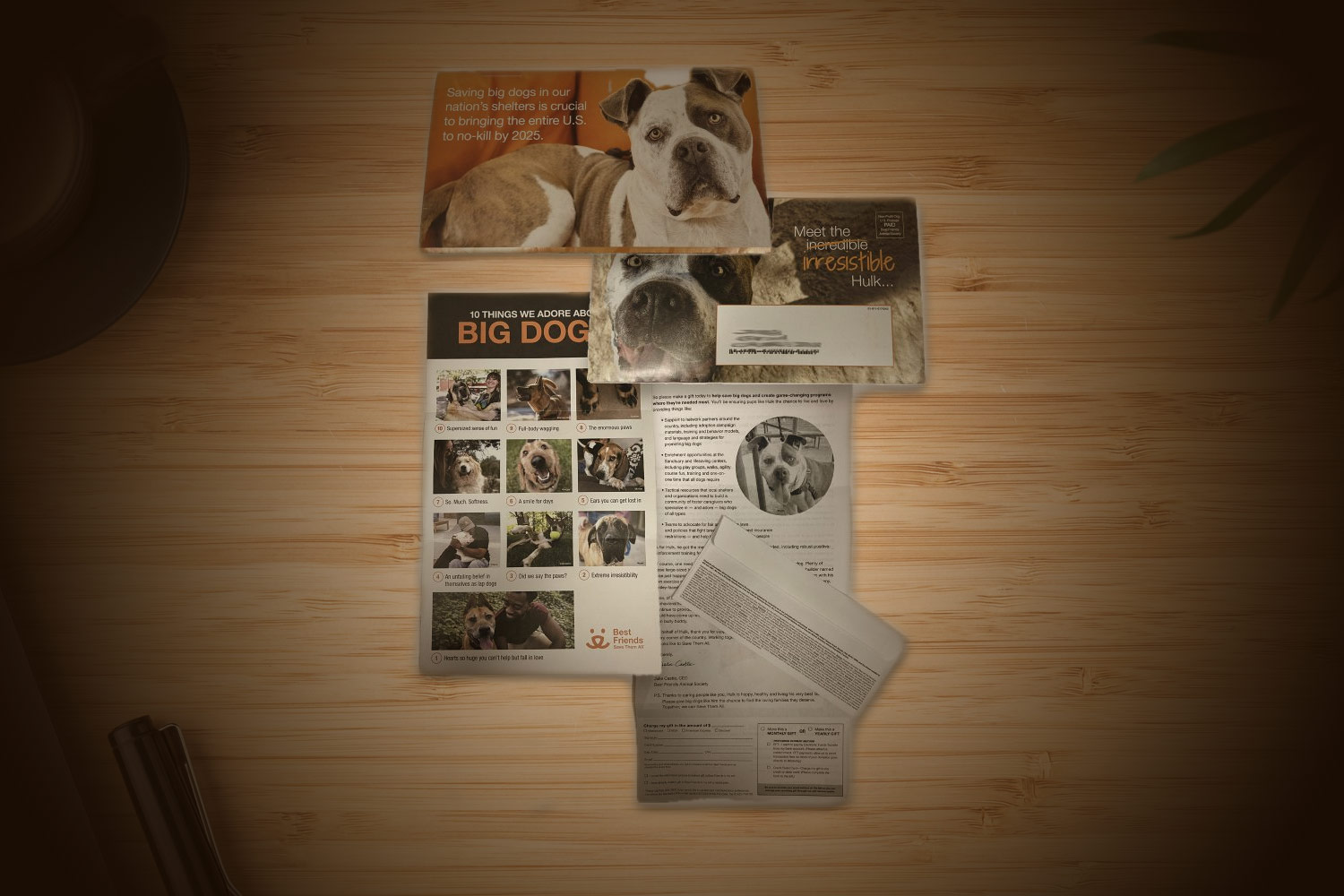
Size matters. What do you notice more in your mailbox? The small 4” x 6” card or a 9” x 12” envelope? If you pair a 9”x 12” envelope with full color images or photos of pets, they are sure to get most people’s attention.

Envelope Design, Presentation, & Paper
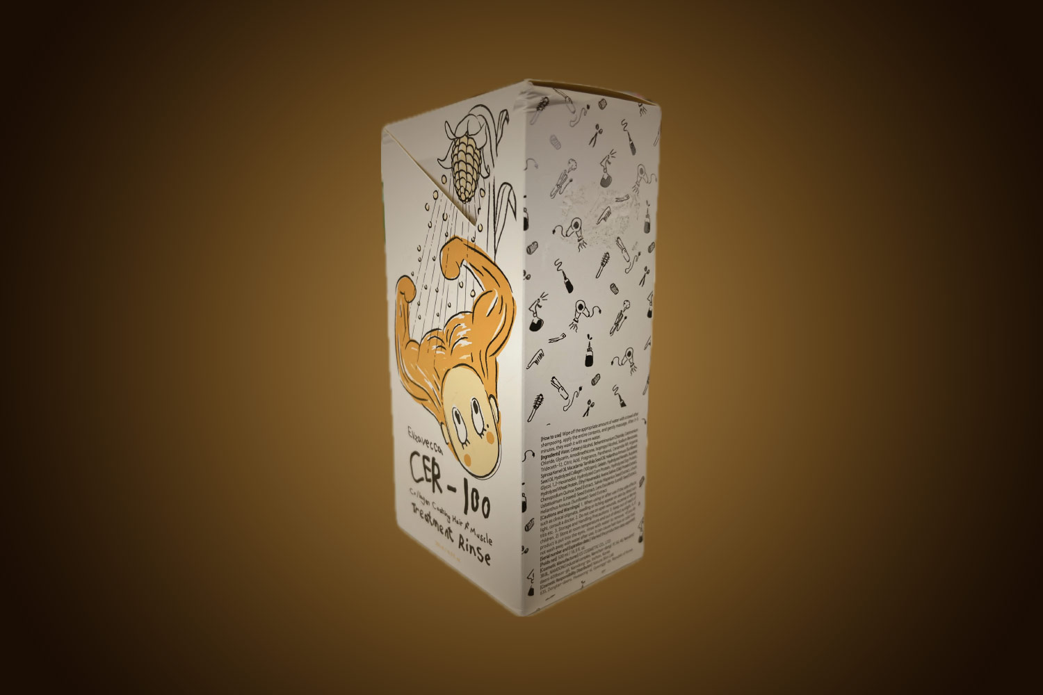
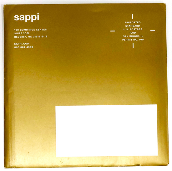
Shape: An unusually shaped envelope will surely make an impression, especially if it is in a solid gold color like Sappi’s 6.5” square envelope. Yes, they do require additional postage, however, the impact should be great enough to cover the cost.
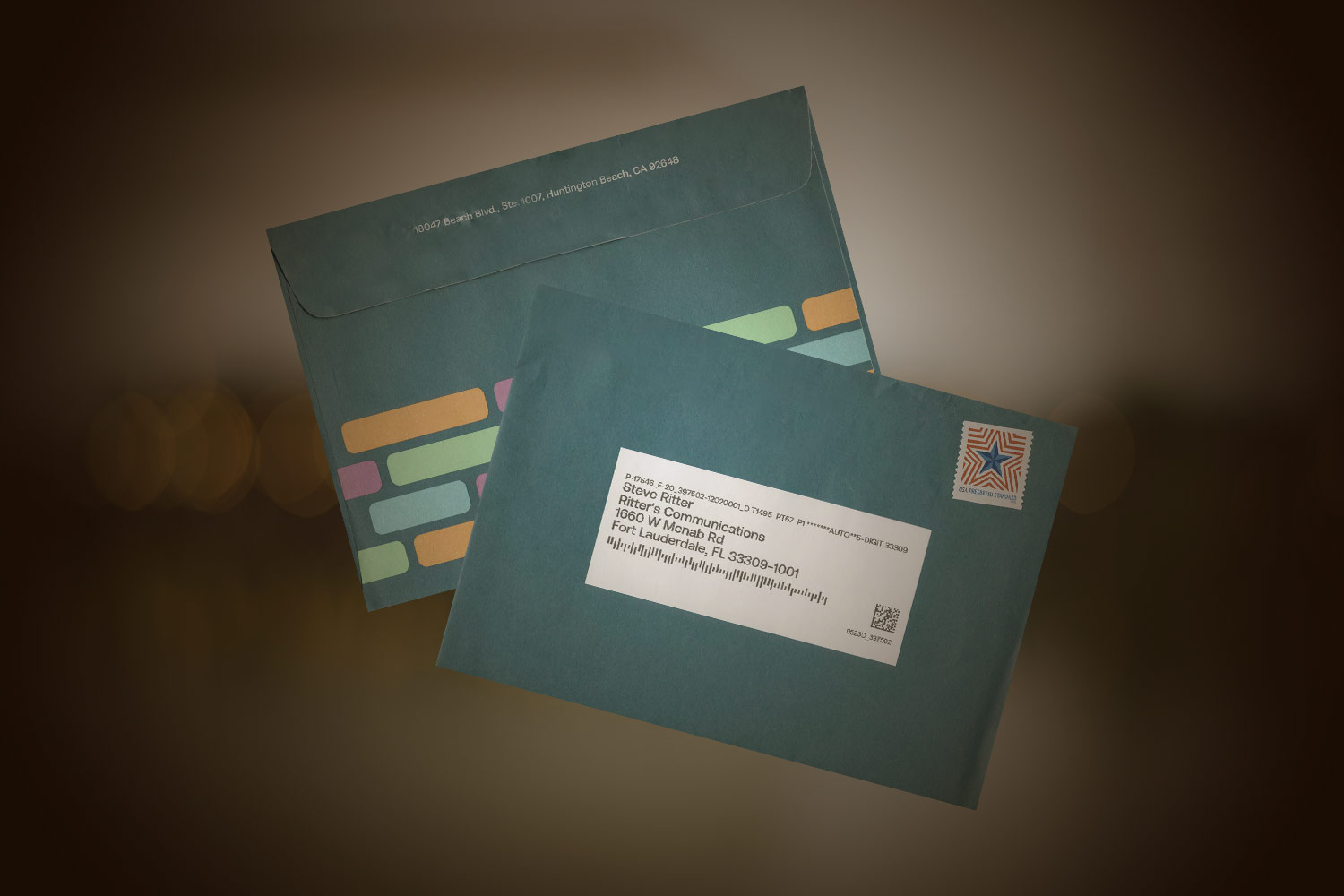
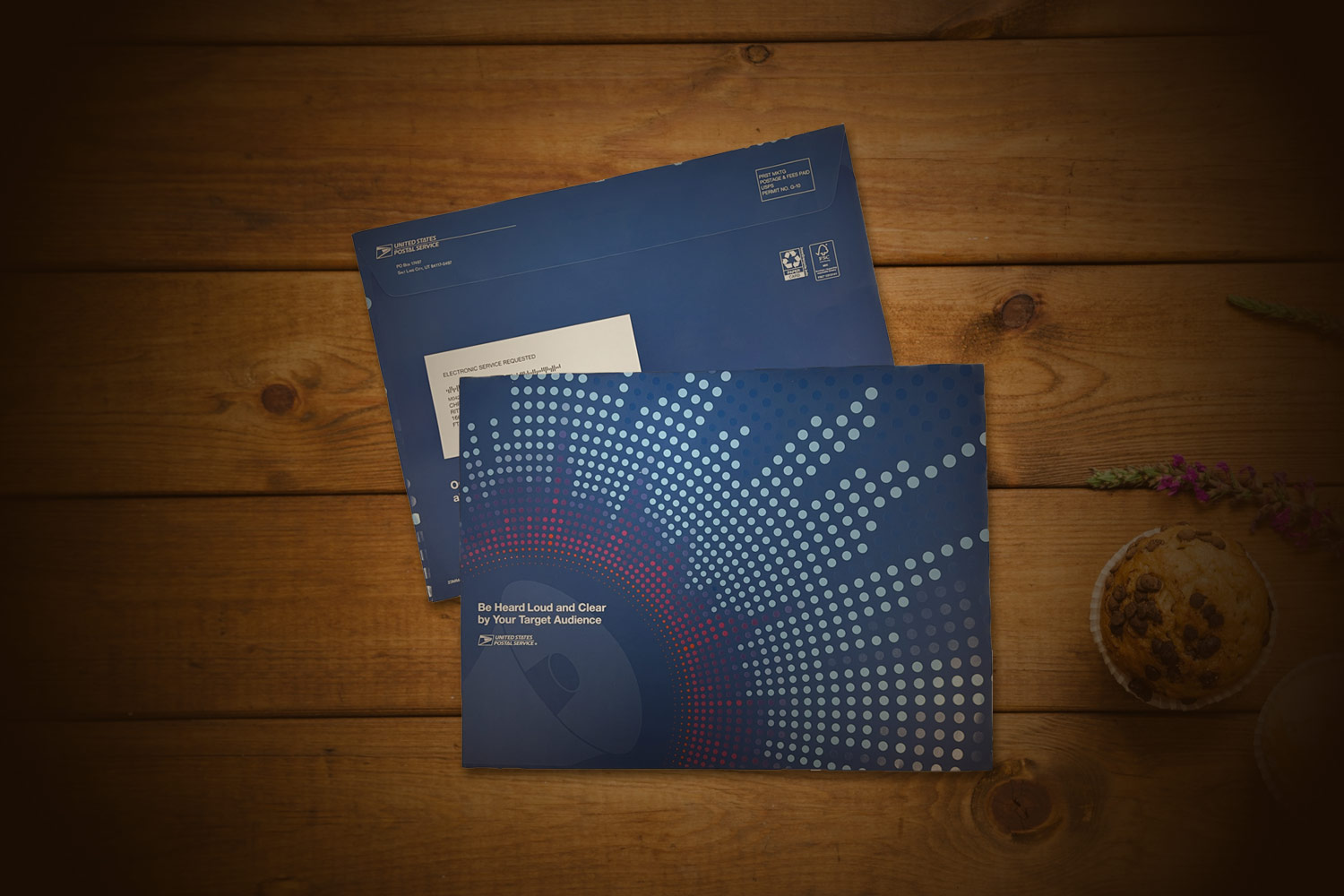
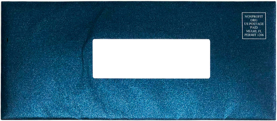
Color: Try using a colored envelope like the Archdiocese of Miami and Miami Rescue Mission. While these are custom-made envelopes and cost more to produce, they are super-noticeable due to their unique colors.

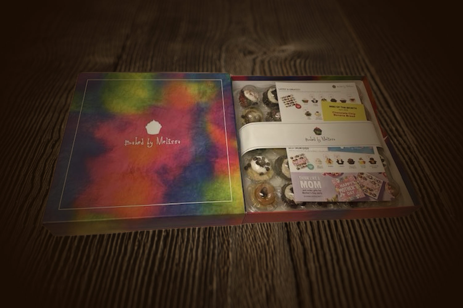
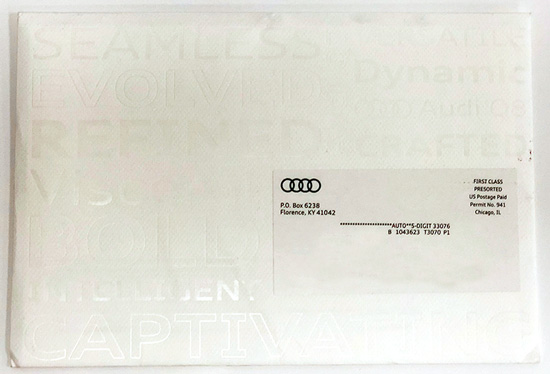
Special techniques: Audi used clear foil on both sides of their envelope which really was a unique “look”. They alternated all caps, upper and lower case, and outlines of the words to create contrast. The words were adjectives used to describe their vehicles and the driving experience. They also used Neenah’s Classic Techweave paper, a high-end finish with a textured feel.
Ritter’s Conclusion
Maximizing ROI is the name of the game. These formats are all eye-catching ways to draw in your prospect with colors, textures, shapes, and sizes.
While there are less expensive ways to send out advertising mail and for “wide net” campaigns, those may be a better option. However, for warmer leads and higher value contacts, it can be worth the expense to make your mail POP and really catch the eye of your potential customers.
The bottom line and take-away? When considering the value of any marketing campaign, consider what a customer is truly worth.
Creative direct mail marketing solutions for every business
Creating memorable marketing collateral isn’t everyone’s forte; if it were, we wouldn’t have a job! If you want help designing eye-catching direct mail that offers a proven return on investment, Ritter’s Printing & Packaging has the expertise you need. When you’re ready to take your direct mail marketing strategy to the next level, call Ritter’s!
