Packaging Ideas – Heavyweights by George
Industry: Paper Manufacturer – International Paper
Purpose: International Papers was introducing a new line of heavyweight, colorful, strong and durable paper meant for specialty packaging. They created a series of folding cartons to mimic real life applications and distributed the containers to designers and printers who are their key clientele. Special printing techniques, laminations, closures, box engineering, and finishes all contribute to getting these boxes noticed on shelves where competition for attention is high. Generating ideas and samples for designers and printing companies keeps International Papers top-of-mind when unusual solutions are called for.
Paper: Heavyweights by George is a line of colorful cover weight papers. Heavier weighted papers have several advantages including a sturdier structure that lends itself to a more tactile and interactive experience for the user. These papers often come in a variety of weights. International Papers used several different colors and weights including White and Marigold 14.6 pt., Moss 11 pt., Kraft 10.5 pt., Coastal Teal and Southern Sun 11 pt., Peach Cobbler 14.6 pt., Atlantic Navy and Dusk 11 pt.
Size: The outer carrying container was approximately 10”L x 7”W x 5”D which included a carrying handle and two inserts on either side of the handle meant to hold six individual cartons. They varied a little in size but most were about 3”L x 3”W x 7”D.


Sustainability: The Heavyweights by George paper line is FSC (Forest Stewardship Council) Certified. The FSC is an international non-profit, multistakeholder organization established in 1993 that promotes responsible management of the world’s forests.
Printing & embellishments: Each of the six cartons used a different color paper, highlighting this line of papers.
Pawley’s sea salt caramels
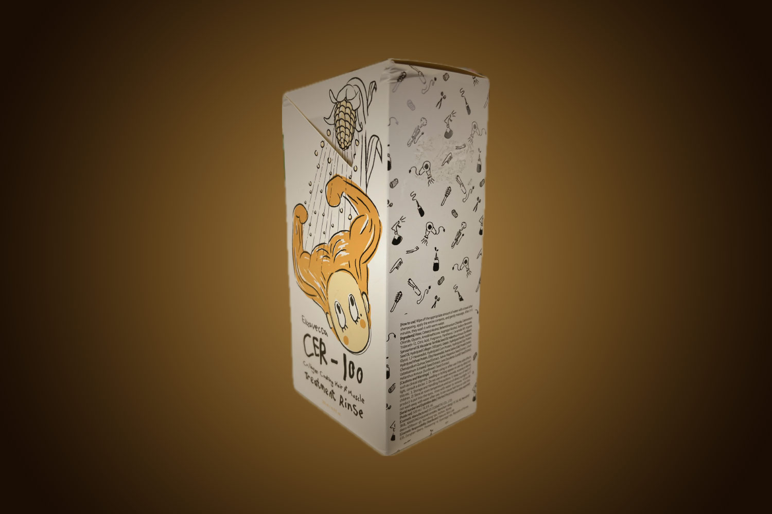
- Food packaging can be creatively designed especially if the food is a novelty. Pawley’s Sea Salt Caramels is printed with lively ocean-themed illustrations. The closure is designed as a triangular fold-over top with a tuck tab close and the overall shape is reminiscent of an old-school paper bag lunch. The candy is hand-made and locally produced. Creating a package that stands out among the other candies is an excellent strategy for commanding the attention of browsing buyers.
- The package was printed with an opaque white under a 4-color process. White satin foil highlights the logo and bubbles. The unique shape was die cut on Moss 11pt paper which was mounted to Kraft 10.5pt paper giving the box a solid 21.5pt substrate to print on and is structurally very solid. The bottom closure is glued.

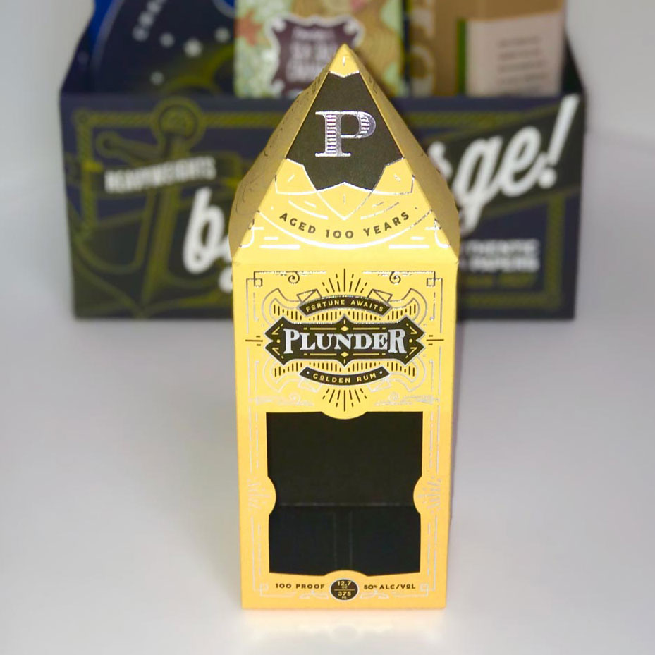
Plunder golden rum
- This wine and spirits box features a window cutout that showcases the actual bottle. Inside the box was flood coated with black ink which playfully adds a sense of “mystery” and plays off the name “Plunder Golden Rum”. The closure designed for this product is unique and although it’s not ideal for stacking inventory, it stands out and demands attention. The pyramid shaped top uses two tuck tabs to complete the closure and is meant to be displayed on a prominent shelf both at the store and at home. The bottom of the box is glued.
- This Spirits box was printed 4 color process and was also foil stamped and die cut. The paper substrate is a 14.6pt Marigold paper from By George.
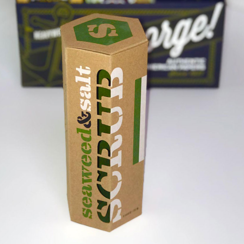
Seaweed & salt scrub
- Health & Beauty package set up as a hexagonal box with two tuck tabs on both the top and the bottom providing an exceptionally secure and sturdy closure. Spot colors printed on a “cardboard” substrate give a no frills and an eco-friendly connotation to the product inside. The box offers a peek of the sea scrub through the cleverly die cut word “SCRUB”.
- This example is printed with 3 inks: opaque white, black and a green spot color. Its shape was die cut from By George’s 10.5pt Kraft paper.
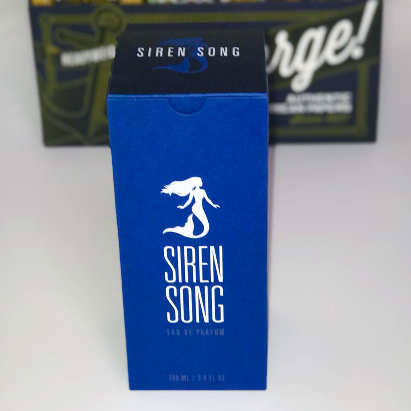
Siren song eau de parfum
- This cosmetics package is built with 2 papers mounted together to provide a sturdier 22pt box made to hold heavier contents like glass and liquids. The limited color palette and use of the wave texture gives the overall appearance a high-end look and provides a tactile experience.
- Printed 4 color process with a spot metallic silver and white gloss foil stamping, this package uses multiple well-thought embellishments to convey luxury. Blind embossing and 2 papers: Atlantic Navy 11pt and Dusk 11pt mounted together pull this design together in a sturdy 22pt thick paper carton.
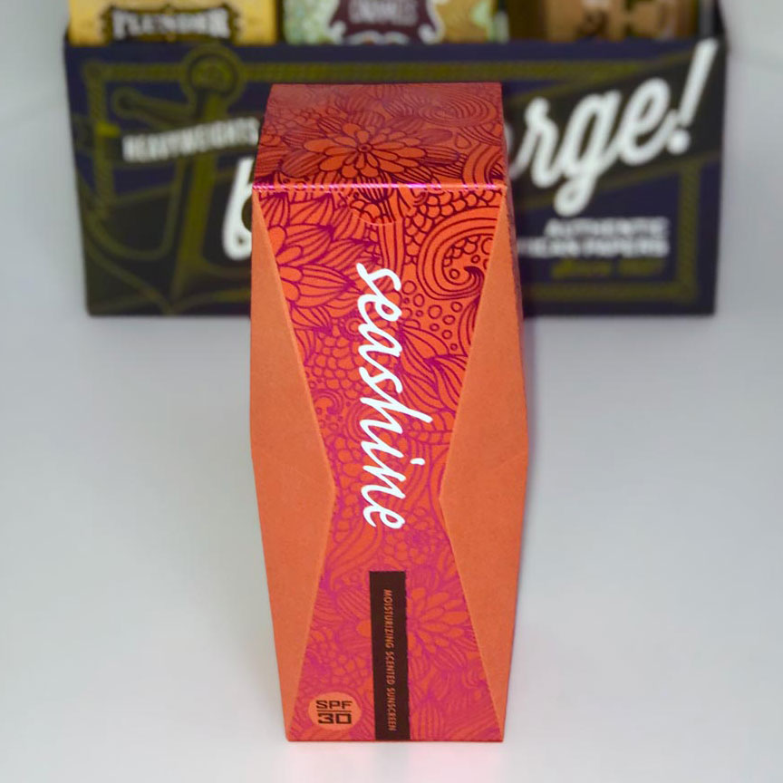
Seashine moisturizing scented sunscreen
- Health & Beauty packaging featuring indented edges presumably to hold the product more securely in place also creates a visual impact as the structure itself is unusual.
- A 4-color process, metallic pink foil and white gloss foil stamping create the printed design. A tuck tab on top and a glued bottom printed on Peach Cobbler 14.6pt paper complete this unusual paper board carton package.
Beacon scented candle
- Retail Product – heavier weight needs a sturdier packaging substrate that had two parts which looked amazing – they used one color paper for the outer sleeve and a different color paper for the inside box which also showed through die cut holes. The contrast between the bright yellow inner layer and the cool blue of the sleeve along with the circular shapes and printed patterns evoke images of the sun, the beach, light and even smoke giving this product well thought-out visual cues that reflect the name and brand. Packaged in a sleeve, the box invites the user to open and interact with it and provides a way for the scented candle to be sampled via the die cut pattern.
- The outer sleeve was printed on 11pt Coastal Teal with spot metallic silver and die cut. The inner sleeve was printed on 11pt Southern Sun with black and spot metallic silver inks and was die cut. The top closure is glued, and bottom closure is a crash bottom.

Some of the most creative techniques for the printing and packaging industry are on full display with International Papers. As a leader in their industry, it’s important to continue to push the idea envelope and stay top-of-mind and ahead of their competition. Though this review is chock-full of ideas, the larger take-away tells us to communicate your businesses products and services as often as you can to prospects and existing clients as that can lead to more business in areas they might not know you for.
Quality Printing and Packaging Solutions You Can Trust
From eye-catching designs to durable, eco-friendly materials, we deliver printing and packaging that makes your brand stand out. Whether you need custom boxes, labels, or marketing collateral, our expert team ensures every detail is flawless — on time and on budget.
Ready to elevate your packaging? Contact us today to get started!
