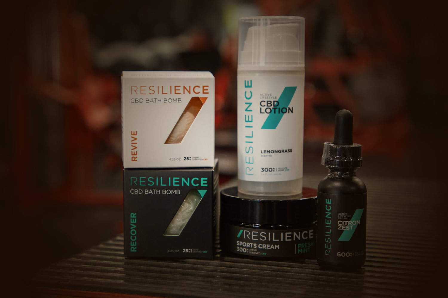
Print design is a critical part of promoting and establishing your company brand. People are visual creatures, and first impressions count. That means you want your product label, brochure, poster, or carton to be professional-looking.
Here we share a few printing tips to ensure that your project is printed accurately and beautifully.
Proofread, proofread, proofread
Grammar and punctuation errors could signal a lack of professionalism or attention to detail, which is not how you want to present your business. Review your print design carefully before going to the printer and have at least two people look over your design for errors before printing the final version.
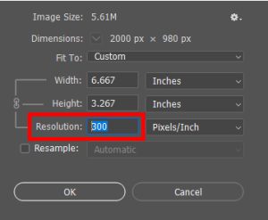
Double-check the image resolution and size
Printed designs need to be at least 300 DPI (dots per inch) in order to show up clearly. A file that is too small will appear grainy when enlarged. Larger images can be scaled down, but pixels can’t be added afterward without affecting the image’s sharpness. Be sure to save your designs in the highest resolution.
Make sure you’re using the right colors (CMYK, RGB)
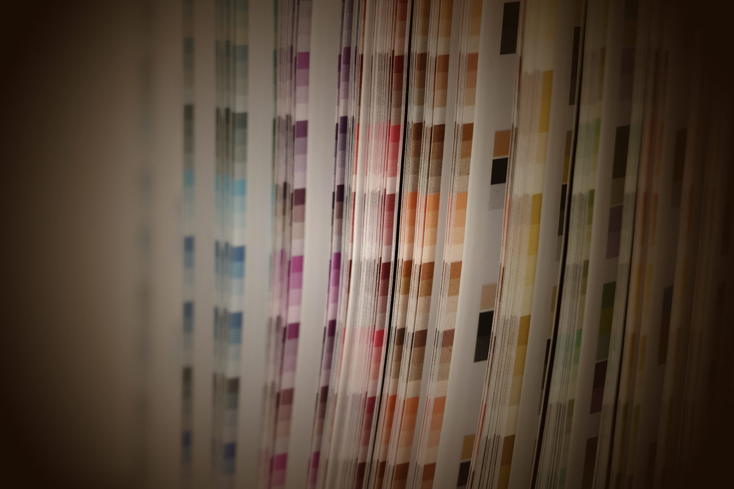
The way your colors appear digitally is not necessarily how they will look when you have the final printed version. Digital cameras, computer monitors, and scanners use RGB (red, green, and blue) light to show color. Commercial printing uses CMYK (cyan, magenta, yellow, and black) to produce different ranges of color. Because digital cameras and computer screens see spectrums of light and color differently than printers do, you need to make sure the two mediums are in sync for a quality print. All visual files associated with the job should be converted to the CMYK color space for a more predictable result.
Use spot colors properly
“Spot colors,” or solid colors, are pure or mixed inks used when a very specific color needs to be achieved. They can be fluorescent, metallic looking, out of the CMYK color space, or just a specific corporate requirement, resulting in a bold variations or precise color requirements called for by the design. Spot colors for shorter runs may be more costly so make sure you ask for a quote before deciding to use these colors in your final design.
Define your crop and bleed marks
Bringing your design to life from its digital form means making sure your crop marks, cut lines, and bleeds are properly lined up. Crop marks and cut lines are the marks that indicate the edges of your design so no part of it is accidentally cut off. A design that reaches the edge of the page has a crisp, professional look to it.
The “bleed” refers to any part of the design or text that may extend past the design boundary. Ignoring the bleed could result in white bordering on one side of the design, which indicates that the paper extended beyond the digital art.
Make sure your files are exported correctly, the first time
A file that has been checked (and double-checked) for errors and follows printing guidelines is ready to export. This can be done by a process called “packaging the file.” If you’re using InDesign, and your printing company requests the original file, you should “lock” any elements you don’t want to move after sending. Simply highlight those elements and select Object > Lock. This will allow you to create a file that the printer will view as you intended. Go to File > Package to “package” the document and create a new file folder with all the supporting files and fonts.
Print design done right in South Florida
Make sure your print designs are done right with Ritter’s Printing & Packaging, a trusted printing company in Fort Lauderdale. To get a quote for your next project, contact us today.


